Choosing chart timeframes for trading instruments

3 minute read
|15 Apr 2024
Best timeframe to use when trading

Few traders consider what sort of timeframe they should be looking at when using price charts for the instruments they're looking to trade. Choosing the right timeframe for charts is an important part of the trading process.

Many traders use chart patterns for their chosen markets to figure out points such as where to buy and sell, where to set a stop-loss order, and how much potential profit or loss there could be in their trading ideas.

This article has been written with the aim of helping you pick the best charts and timeframes for the markets you wish to trade.

Picking the right chart timeframes

We are spoiled for choice when it comes to chart data. If we want, we can have a chart that shows every single price change in the market we are watching, tick by tick. Many who are new to trading start by focusing on these very short-term charts. But that is not necessarily the best approach, particularly if you are trading markets that are not as volatile hour by hour (ones that do not move too much). Let’s look at a couple of examples:
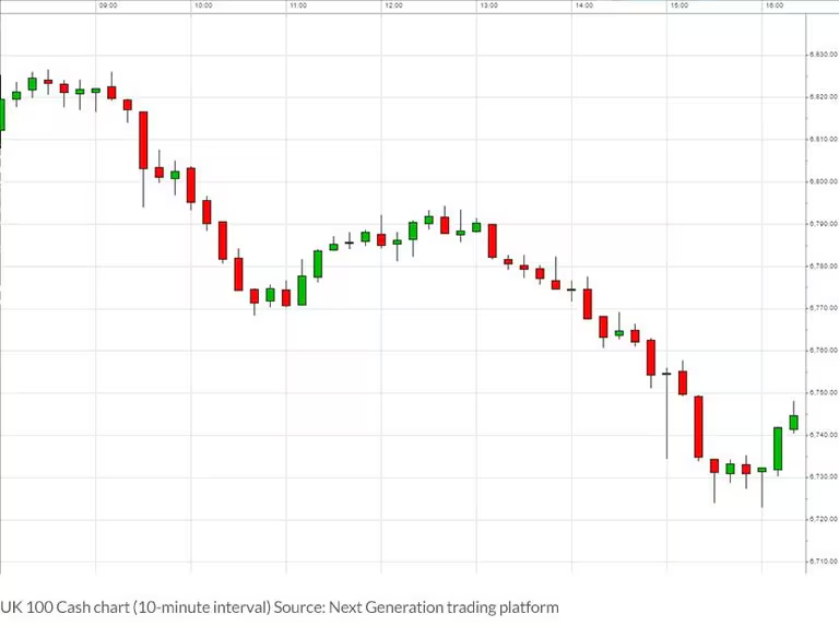
UK 100 10-minute chart

UK 100 Cash chart (10-minute interval)

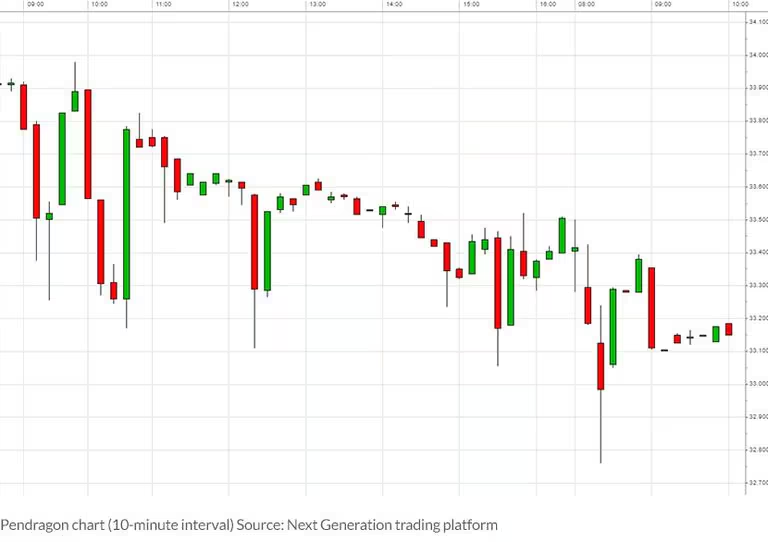
Pendragon 10-minute chart

Pendragon chart (10-minute interval)

Both these charts show the trading day in chunks of 10-minute intervals, as indicated by the candlesticks. The first chart, the UK 100 stock market index (which is based on the underlying FTSE 100), has a range of around 100 points on short-term traders, this is a very tradeable day and they may see plenty of opportunities to try and make money.

The second chart is of Pendragon, a company listed on the UK stock market. The time period shown is one day, but the range on the day was less than two pence!

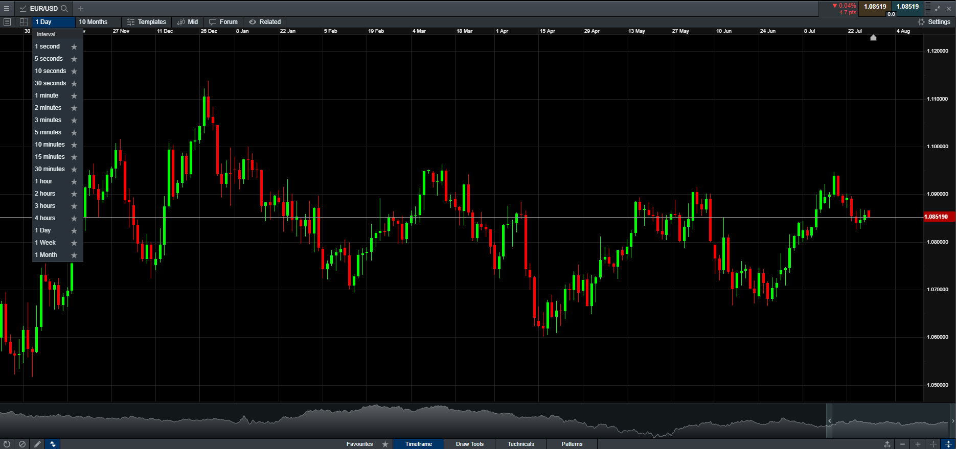
A day trader watching short-term charts on both these markets will probably be presented with more opportunities in the UK 100 rather than Pendragon. That’s not to say you can’t make money trading shares rather than indices, but it may make more sense to have a longer-term view. For example, for many experienced traders of individual shares, a daily candlestick chart does the job perfectly.

Short-term charts vs longer term charts

Using shorter-term charts for instruments in volatile markets and longer-term charts for quieter markets still isn’t the answer, however.

It helps to remember that longer-term charts still have their place even when markets are swinging wildly. You may be following a textbook trend on a chart showing one day of, for example, the Pound/US Dollar exchange rate (GBP/USD). But it may be a whisker away from what has been a real barrier for many months, and you would only see that if you were looking at the bigger picture.

So, when matching charts to various markets, even if you consider yourself a very short-term trader, it does not do any harm at all to examine the longer-term view at the start of your day. There could be a level coming up with the potential to reverse any short-term trend, and this in itself can be another trading opportunity.

Join over 1,000,000 clients on our award-winning trading platform
Practise trading with $10,000 of virtual funds on a risk-free demo account.
Access 12,000+ instruments on our award-winning Next Generation platform. Including indices, forex and shares.
Enhance your trading on MetaTrader4 with CMC Markets and access 175+ forex pairs.
No hidden fees, tight spreads and low margin rates.