What are candlestick charts?

7 minute read
|16 Apr 2024
Candle stick chart
Table of contents
  • 1.
    The candlestick body
  • 2.
    How to interpret candlestick charts
  • 3.
    How to use candlestick charts

Candlestick charts are price charts. Prices on candlestick charts are denoted by candlesticks. This form of price representation was invented in Japan and made its first appearance in the 1700s.​

Munehisa Homma, a rice trader, is regarded as the originator of the concept. He used candlestick charts in the rice futures market, with each candlestick graphically representing four dimensions of price in a trading period. These four dimensions are the open, the high, the low and the close. A trading period is a time period from one second upwards.

Today, candlestick charts are used to track prices in all financial markets. These markets include foreign exchange (forex)commoditiesindices, treasuries and the stock market. Stocks represent the largest number of traded financial instruments. The prices at which these instruments are traded are recorded and displayed graphically by candlestick charts. Candlestick charts are one of the most prevalent methods of price representation.

Candlestick chart analysis is an essential skill for traders. Candlestick charts are used to plot prices of financial instruments. The chart analysis can be interpreted by individual candles and their patterns. Bullish candlestick patterns may be used to initiate long trades. Bearish candlestick patterns may be used to initiate short trades.

The candlestick body

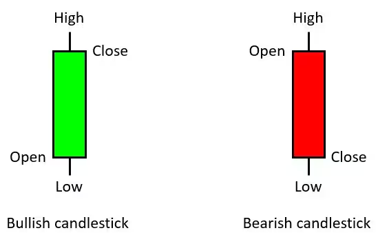
A candlestick consists of a body and two wicks. The body of a candlestick is drawn as a rectangle, which marks the open and the close of a period. In a bull candle the open is indicated by the bottom of the rectangle while the close is indicated by the top of the rectangle. In a bear candle the opposite is true, with the period’s closing price falling below the period’s opening price. A major benefit is that the candlestick’s body can be colourfully displayed. This allows a trader to quickly get a picture of whether the buyers or sellers are controlling price. The wicks are drawn as two vertical lines above and below the body. The wicks mark the high and the low that price has achieved for the period. The candlestick range is defined by the extreme high of the top wick above the body and the extreme low of the bottom wick.

Bullish Candlestick - Bearish Candlestick

Candlesticks graphically display market sentiment. A close above an open indicates bullish market sentiment, and this is denoted by a green candle. Such a candle is called a bull candle. A close below an open indicates bearish market sentiment. This is denoted by a red candle and is called a bear candle. Market sentiment is also denoted by the wicks. A long wick on either side of the candlestick indicates strong rejection of a price level by the market.

Sustained price movement in a particular direction is called a market trend. When prices move higher in a sustained manner the prevailing market trend is up. When prices move lower in a sustained manner the prevailing market trend is down. Changes in market trend may present good trading opportunities. It is therefore useful for traders to be able to identify changes in market trend.

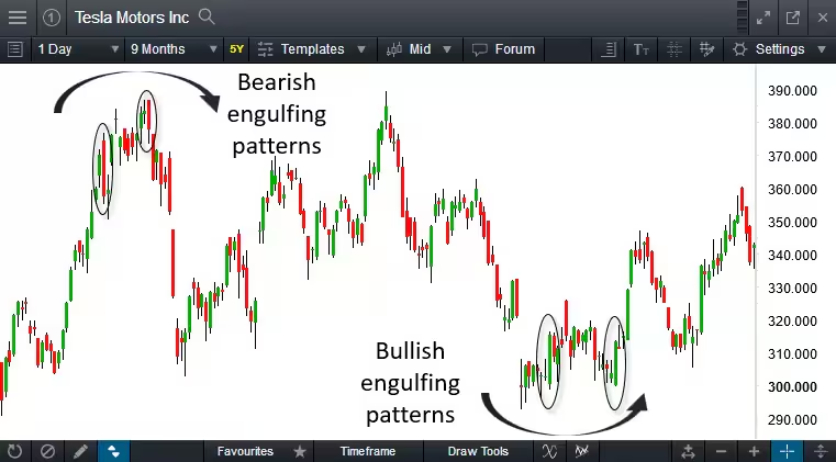
Candlestick charts are especially helpful in identifying market trend changes. An engulfing candle pattern is one such indicator of a potential change in market trend. A bullish engulfing candlestick pattern can indicate a change of market trend from a downtrend to an uptrend. Likewise, a bearish engulfing candlestick pattern indicates a change of market trend, from an uptrend to a downtrend. A bullish engulfing candlestick pattern forms when a large bull candle completely envelopes the previous and relatively smaller bear candle. This pattern can signify a change in market sentiment, from bearish to bullish. It is therefore seen as an indicator of market trend change.

An important consideration is the location of where these engulfing patterns are situated in the context of an overall price trend. In the illustration below, it becomes evident that when these patterns are situated at the extremes of a price trend, they tend to have a bearing on where price is likely to head next.

Tesla Motors Inc

From CMC Market’s Next Generation platform: Engulfing patterns situated at the extremes of a price trend can signify a possible price reversal is imminent. For illustrative purposes only.

How to interpret candlestick charts

Traders make important decisions on whether to buy or sell financial products by analysing market conditions and the instruments themselves. This analysis can be based on non-price information. Such analysis using non-price information is known as fundamental analysis. On the other hand, a buying or selling decision based on past and present prices of a financial instrument is known as technical analysis.

For technical analysis to be carried out, prices need to be represented graphically on a chart. Candlestick charts present the technical analyst with a visual snapshot of the market. Eventually, with time and experience, you can quickly analyse market conditions and make a trading decision through technical analysis. 

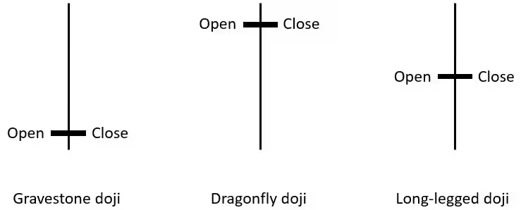
Each individual candlestick informs the technical analyst about the prevailing market conditions. Two important types of candlesticks are the doji and the hammer, or inverted hammer. A doji is a type of candlestick where the open and the close happen at the same price point. This results in the body being reduced to a line instead of a rectangle. In other words, a doji is a candle without a real body of any size. There are three main kinds of doji: the long-legged doji, the dragonfly doji, and the gravestone doji.

  • The dragonfly doji has no real body with a long wick to the bottom.  The top wick is either small or absent. The large bottom wick is evidence of rejection of a lower price in favour of a higher price, and therefore can denote bullish market sentiment.

  • The gravestone doji is like an inverted dragonfly doji. It has a long wick on top and no real body. The bottom wick is small or absent. The large top wick represents rejection of a higher price in favour of a lower price and can therefore denote bearish sentiment.

  • The long-legged doji is shaped in the form of a cross. Both top and bottom wicks are long and of approximately equal length. It indicates that neither the bulls nor bears have had their say and therefore denotes a situation of uncertainty with respect to market trend.

  • The hammer and inverted hammer are close cousins of the dragonfly doji and gravestone doji respectively. The difference in these cases is that the candlesticks have small real bodies as opposed to no bodies at all like the doji.

The three main types of doji:

Doji

Candlestick patterns confirm market occurrences in conjunction with individual candles. Candlestick patterns are either continuation patterns or reversal patters. Examples of continuation patterns are three white soldiers or three black crows. These are patterns with three bull candles or three bear candles in a row. They indicate that a trend is likely to continue in a particular direction. Three white soldiers signify the continuation of an uptrend. Three black crows signify the continuation of a downtrend.

It is important for traders to be direction agnostic, as a trader has the potential to make a profit (or loss) irrespective of whether the market is rising or falling. Entering a position when the market is falling is known as going short. A trader would usually only initiate a short position when a market trend has reversed from an uptrend to a downtrend.

How to use candlestick charts

The never-ending tussle between buyers and sellers helps in constructing the candlestick line over time. Candlestick charts are often used to make investment and trading decisions, or in some cases, used for making adjustments to one’s trading decisions. These trading decisions could include opening a new trade, closing an existing one, or scaling out of a trade to capture partial profits.

The size of a candlestick’s real body along with its wicks or tails can indicate a market’s volatility. Long wicks or tails in conjunction with a small real body signify a volatile market. When a candle has long wicks with a relatively small real body the candles appear “spiky”. The long wicks or tails on these candles can signify a rejection of certain price levels. A candle with a small real body and with long wicks or tails on both sides denotes extreme volatility as well as market indecision. Such candles indicate the lack of market trend.

Candlestick charts can be an important tool for the trader seeking an investment opportunity over a long timeframe. These investment trades would often be based on fundamental analysis to form the trade idea. The trader would then use the candlestick charts to signify the time to enter and exit these trades. For traders with a tighter timeframe, such as trading the fast-paced forex markets, timing is paramount in these decisions. Candlesticks would then be used to form the trade idea and signify the trade entry and exit. Technical analysis using candlestick charts then becomes a key part of the technical trader’s trading plan.

Join over 1,000,000 clients on our award-winning trading platform
Practise trading with $10,000 of virtual funds on a risk-free demo account.
Access 12,000+ instruments on our award-winning Next Generation platform. Including indices, forex and shares.
Enhance your trading on MetaTrader4 with CMC Markets and access 175+ forex pairs.
No hidden fees, tight spreads and low margin rates.
Support
Support
x

Welcome to CMC Markets Support!

To begin, please select the product your query is related to.