Trading chart patterns guide
Chart patterns are an important tool which should be utilised as part of your technical analysis. From beginners to professionals, chart patterns play an integral part when looking for market trends and predicting movements. They can be used to analyse all markets including forex, shares, commodities and more.
Chart patterns often form shapes, which can help predetermine price breakouts and reversals. Recognising chart patterns will help you gain a competitive advantage in the market, and using them will increase the value of your future technical analyses. Before starting your chart pattern analysis, it is important to familiarise yourself with the different types of trading charts.
While the idea of pattern recognition may seem strange, it's based on carefully tested methods which underline their usefulness to traders. Importantly, patterns are factors to consider when calculating where to enter, set stop-loss orders, and where to set your profit targets. These factors are, of course, some of the key things that all traders will wish to consider when managing their overall portfolio.
- Recognise how price movements can develop into price patterns
- Isolate sensible entry points
- Manage risk with stop losses and set profit targets
Types of trading charts
Our Next Generation platform has several chart types on offer including the popular line, bar (OHLC) and candlestick charts. The best chart for you depends on how you like your information displayed and your trading level. You can find out more from our video on different chart types and their best uses.
Line chart

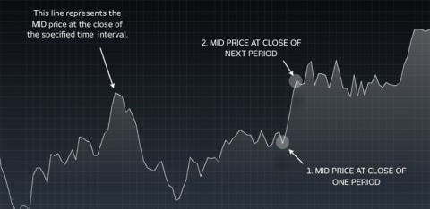
Line charts are the simplest type of charts in financial markets. There is no high or low point specified, unlike bar and candlestick charts, and they are instead based on lines drawn directly between closing prices. This chart type is commonly utilised in reports and presentations to show general price movements, however they often lack granular information when compared to other trading chart options.
OHLC (American Bar) chart

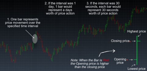
Bar charts or OHLC charts (open high low close chart), unlike line charts show both the opening and closing price, as well as the highs and lows for the specified period. As opposed to a line, the data is more in depth and uses a single vertical bar. The top of the bar represents the highest price achieved for the specified time frame and the bottom of the bar the lowest price. Additionally, a horizontal bar extends to the left of the bar which denotes the opening price and a short horizontal bar to the right which signifies the closing price. The direction of a trade can be seen from the colour of the bar. A green bar indicates that the closing price was higher than the open, however red indicates that the opening price was higher than the close.
Candlestick chart

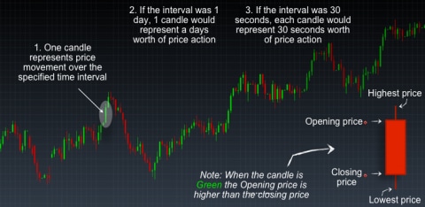
Candlestick charts are very similar to bar charts but are more popular with traders. Like bar charts the candlestick’s highest wick is the highest price in that period and the lowest wick is the lowest price. The candlestick body represents the difference between the opening and closing price, which can help to indicate price movements. The candlestick is green or red subject to a bullish or bearish movement respectively. A bullish movement is an uptrend, whilst a bearish movement shows a downtrend. Find out how to read the bear and bull markets effectively here.
Many chart patterns can be represented best on candlestick charts, as candlestick charts have their own set of chart patterns alongside the ones outlined in this article. For in-depth analysis on candlestick charts and their specific patterns, see our introduction to candlestick charts and our candlestick charts pattern guide.
12 most important stock chart patterns
The following chart patterns are the most recognisable and common trading patterns to look out for when using technical analysis to trade shares, forex and other markets. Following our guide of the 11 most important stock chart patterns that can be applied to most financial markets could be a good way to start your technical analysis.
Ascending triangle
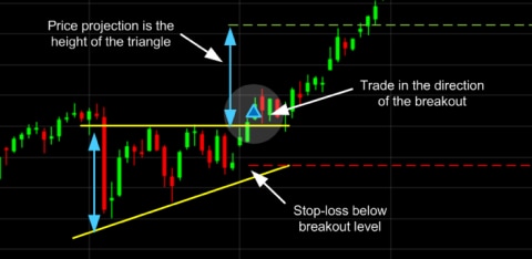
The ascending triangle is a bullish ‘continuation’ pattern that signifies a breakout is likely where the triangle lines converge. To draw this pattern, you need to place a horizontal line (the resistance line) on the resistance points and draw an ascending line (the uptrend line) along the support points.

Descending triangle
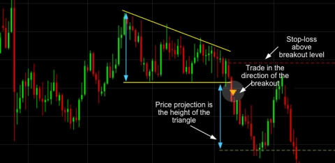
Unlike ascending triangles, the descending triangle represents a bearish market downtrend. The support line is horizontal, and the resistance line is descending, signifying the possibility of a downward breakout.

Symmetrical triangle
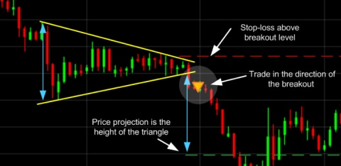
For symmetrical triangles, two trend lines start to meet which signifies a breakout in either direction. The support line is drawn with an upward trend, and the resistance line is drawn with a downward trend. Even though the breakout can happen in either direction, it often follows the general trend of the market.

Pennant
Pennants are represented by two lines that meet at a set point. They are often formed after strong upward or downward moves where traders pause and the price consolidates, before the trend continues in the same direction.
Channels
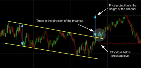
Having looked at setups where the support and resistance levels are moving closer together, the channel setup shows where the two levels run parallel to one another. Although the pattern looks very different to any of the triangle family, the behaviours in terms of the setups are quite similar, in terms of the breakout and risk management.
The channel chart pattern can be shaped as a rectangle, where the support and resistance lines run parallel until there is a breakout. The breakout is usually the opposite direction of the trendlines, meaning this is a reversal pattern.
A flag is a shorter-term version of the channel, much like how the pennant is a shorter-form of a triangle. Flags require many of the same characteristics as the pennant in order to be confirmed as genuine.
Both the flag and the pennant occur after a sharp movement in price – this near-vertical price move forms the ‘flag pole’ on which the pennant or the flag occurs. It's important to see this in the lead-up because the pattern is not genuine without it. Lastly, you are likely to see a spike in volume in both cases on the breakout, which will add to the confirmation of the pattern.

Wedge
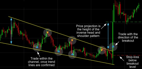
A wedge represents a tightening price movement between the support and resistance lines, this can be either a rising wedge or a falling wedge. Unlike the triangle, the wedge doesn’t have a horizontal trend line and is characterised by either two upward trend lines or two downward trend lines.
For a downward wedge it is thought that the price will break through the resistance and for an upward wedge, the price is hypothesised to break through the support. This means the wedge is a reversal pattern as the breakout is opposite to the general trend.

Double top
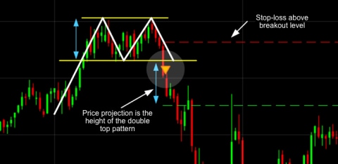
The double top is a simple yet effective chart pattern that most commonly indicates that an upward trend may be losing momentum. It occurs when a stock hits a price level but meets resistance and falls back down from it (see highlighted area in chart). When the price moves back up but fails to break the previous high, it forms the influential double top pattern. The double top pattern is considered complete when the price falls back and breaks the previous low, indicating further weakness. The target being the 'height' of the pattern projected down from where it breaks that low.

Double bottom
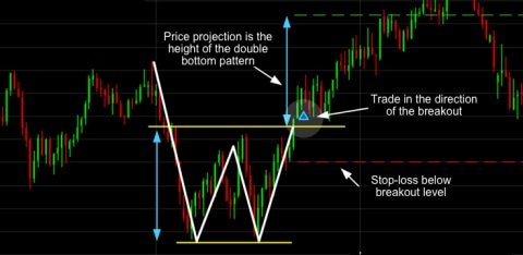
The double bottom is the opposite of a double top and applies to a falling market. In a double bottom, the falling price hits a low point and then bounces back up. The price turns lower again but doesn't break through that previous low. It's when the price rallies and pushes through the previous high that the double bottom is completed. The target can then be perceived as the height of that double bottom, projected from that breakout point (see second arrow in accompanying chart).A double bottom looks similar to the letter W and indicates when the price has made two unsuccessful attempts at breaking through the support level. It is a reversal pattern as it highlights a trend reversal. After unsuccessfully breaking through the support twice, the market price shifts towards an uptrend.

Trendlines and break outs
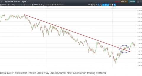
Like the classic cliché 'the trend is your friend', chart followers look to identify a trend in a particular stock and jump on board with the intention of riding that move further. But of course trends don't last forever and a trendline break can be another influential stock pattern. Trendlines are drawn underneath rising lows in an uptrend (indicating buying demand) and above falling highs in a downtrend (indicating selling pressure). A break in this level, as indicated by the blue circle in the accompanying chart, is an indication that a change of trend could be on the cards, often prompting traders and investors to adjust their positions accordingly.

Head and shoulders
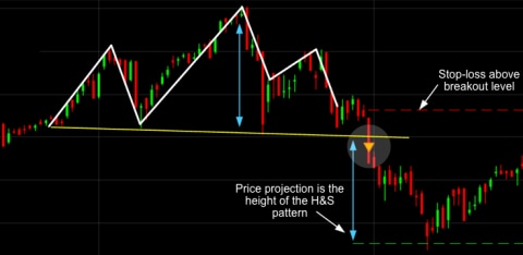
The head and shoulders pattern is similar to a double top, but is made up of three highs (a peak, followed by a larger peak and then a small peak again, hence the name head and shoulders). Typically in a head and shoulders pattern, the second peak should be the largest, indicating the head, followed by a lower high in the third peak. The chartist will draw a smaller trendline under the recent lows, referred to as the 'neckline'. It is when this trendline is broken and price moves lower that the head and shoulders pattern is said to be complete, and the target is for a move lower still – equal to the height of the 'head' in the pattern. Head and shoulders are reversal patterns that are used to indicate a possible change in sentiment from a bullish to a bearish market or vice versa.

Rounding bottom
A rounding bottom or cup usually indicates a bullish upward trend. Traders can buy at the middle of the U shape, capitalising on the bullish trend that follows as it breaks through the resistance levels.
Cup and handle
The cup and handle is a well-known continuation pattern that signals a bullish market trend. It is the same as the above rounding bottom, but features a handle after the rounding bottom. The handle resembles a flag or pennant, and once completed can see the market breakout in a bullish upwards trend.
Price targets
It's possible to use all the patterns discussed to target an eventual profit-taking point. In the case of the triangles and the rectangle, this is done easily by measuring the height of the pattern and then extrapolating the target out from the breakout point.
The same basic premise is applied to the rectangle. In the case of flags and pennants, the target is determined by measuring the height of the flagpole leading into the formation and then added on the way out. These formations are sometimes referred to as measuring formations because they often occur halfway through the price swing.
How to recognise chart patterns
Chart patterns can sometimes be quite difficult to identify on charts when you’re a beginner and even when you’re a professional trader. Luckily, we have integrated our pattern recognition scanner as part of our innovative next generation trading platform. Our pattern recognition scanner helps identify chart patterns automatically, saving you time and effort.
The pattern recognition scanner collates data from over 120 of our most popular products and alerts you to potential technical trading opportunities across multiple time intervals.
Using popular patterns such as triangles, wedges and channels, coupled with our bespoke star rating system, the pattern recognition scanner updates every 15 minutes to continuously highlight potential emerging and completed technical trade set-ups.
Summary
- You should recognise basic price conditions required for a pattern to be genuine
- You should know how to tell when a pattern has failed
- You should be able to generate a sensible risk-management plan in line with your pattern-recognition skills


