Stock chart patterns guide
Chart patterns are an important tool which should be utilised as part of your technical analysis. From beginners to professionals, chart patterns play an integral part when looking for market trends and predicting movements. They can be used to analyse all markets including forex, shares, commodities and more.
Chart patterns often form shapes, which can help predetermine price action, such as stock breakouts and reversals. Recognising chart patterns will help you gain a competitive advantage in the market, and using them will increase the value of your future technical analyses. Before starting your chart pattern analysis, it is important to familiarise yourself with the different types of trading charts.
Trading chart types
Our Next Generation platform has several chart types on offer including the popular line, bar (OHLC) and candlestick charts. The best chart for you depends on how you like your information displayed and your trading level. You can find out more from our video on different chart types and their best uses.
Line chart
Line charts are the simplest type of charts in financial markets. There is no high or low point specified, unlike bar and candlestick charts, and they are instead based on lines drawn directly between closing prices. This chart type is commonly utilised in reports and presentations to show general price movements, however they often lack granular information when compared to other trading chart options.

Bar (OHLC) chart
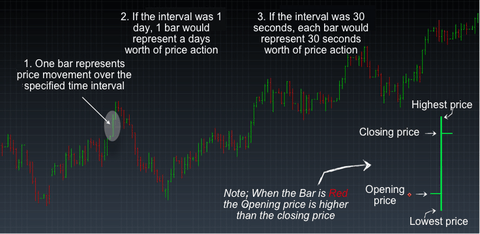
Bar charts or OHLC charts (open high low close chart), unlike line charts show both the opening and closing price, as well as the highs and lows for the specified period. As opposed to a line, the data is more in depth and uses a single vertical bar. The top of the bar represents the highest price achieved for the specified time frame and the bottom of the bar the lowest price. Additionally, a horizontal bar extends to the left of the bar which denotes the opening price and a short horizontal bar to the right which signifies the closing price. The direction of a trade can be seen from the colour of the bar. A green bar indicates that the closing price was higher than the open, however red indicates that the opening price was higher than the close.
Candlestick chart
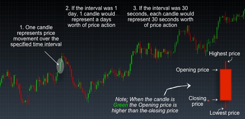
Candlestick charts are very similar to bar charts but are more popular with traders. Like bar charts the candlestick’s highest wick is the highest price in that period and the lowest wick is the lowest price. The candlestick body represents the difference between the opening and closing price, which can help to indicate price movements. The candlestick is green or red subject to a bullish or bearish movement respectively. A bullish movement is an uptrend, whilst a bearish movement shows a downtrend. Many chart patterns can be represented best on candlestick charts, as candlestick charts have their own set of chart patterns alongside the ones outlined in this article.
11 significant stock chart patterns
The following chart patterns are the most recognisable and common trading patterns to look out for when using technical analysis to trade shares, forex and other markets. Following our guide of the 11 most important stock chart patterns that can be applied to most financial markets could be a good way to start your technical analysis.
1. Ascending triangle
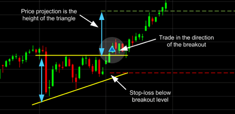
The ascending triangle is a bullish ‘continuation’ pattern that signifies a breakout is likely where the triangle lines converge. To draw this pattern, you need to place a horizontal line (the resistance line) on the resistance points and draw an ascending line (the uptrend line) along the support points.
2. Descending triangle
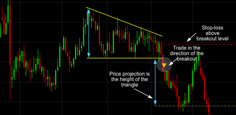
Unlike ascending triangles, the descending triangle represents a bearish market downtrend. The support line is horizontal, and the resistance line is descending, signifying the possibility of a downward breakout.
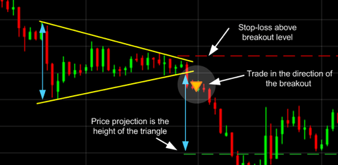
3. Symmetrical triangle
For symmetrical triangles, two trend lines start to meet which signifies a breakout in either direction. The support line is drawn with an upward trend, and the resistance line is drawn with a downward trend. Even though the breakout can happen in either direction, it often follows the general trend of the market.
4. Pennant
Pennants are represented by two lines that meet at a set point. They are often formed after strong upward or downward moves where traders pause and the price consolidates, before the trend continues in the same direction.
5. Flag
The flag chart pattern is shaped as a sloping rectangle, where the support and resistance lines run parallel until there is a breakout. The breakout is usually the opposite direction of the trendlines, meaning this is a reversal pattern.
6. Wedge
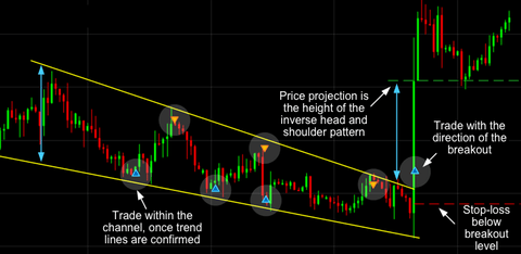
A wedge represents a tightening price movement between the support and resistance lines, this can be either a rising wedge or a falling wedge. Unlike the triangle, the wedge doesn’t have a horizontal trend line and is characterised by either two upward trend lines or two downward trend lines.
For a downward wedge it is thought that the price will break through the resistance and for an upward wedge, the price is hypothesised to break through the support. This means the wedge is a reversal pattern as the breakout is opposite to the general trend.
7. Double bottom
A double bottom looks similar to the letter W and indicates when the price has made two unsuccessful attempts at breaking through the support level. It is a reversal pattern as it highlights a trend reversal. After unsuccessfully breaking through the support twice, the market price shifts towards an uptrend.

8. Double top
Opposite to a double bottom, a double top looks much like the letter M. The trend enters a reversal phase after failing to break through the resistance level twice. The trend then follows back to the support threshold and starts a downward trend breaking through the support line.

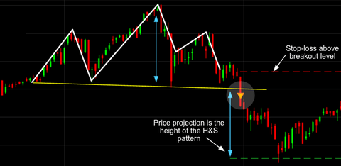
9. Head and shoulders
The head and shoulders pattern tries to predict a bull to bear market reversal. Characterised by a large peak with two smaller peaks either side, all three levels fall back to the same support level. The trend is then likely to breakout in a downward motion.
10. Rounding bottom
A rounding bottom or cup usually indicates a bullish upward trend. Traders can buy at the middle of the U shape, capitalising on the bullish trend that follows as it breaks through the resistance levels.
11. Cup and handle
The cup and handle is a well-known continuation pattern that signals a bullish market trend. It is the same as the above rounding bottom, but features a handle after the rounding bottom. The handle resembles a flag or pennant, and once completed can see the market breakout in a bullish upwards trend.
How to easily recognise chart patterns
Chart patterns can sometimes be quite difficult to identify on charts when you’re a beginner and even when you’re a professional trader. Luckily, we have integrated our pattern recognition scanner as part of our innovative Next Generation trading platform. The pattern recognition scanner collates data from over 120 of our most popular products and alerts you to potential technical trading opportunities across multiple time intervals.
Using popular patterns such as triangles, wedges and channels, coupled with our bespoke star rating system, the pattern recognition scanner updates every 15 minutes to continuously highlight potential emerging and completed technical trade set-ups.
Want to put these trading patterns to use? Open a demo account today
Disclaimer
CMC Markets is an execution-only service provider. The material (whether or not it states any opinions) is for general information purposes only, and does not take into account your personal circumstances or objectives. Nothing in this material is (or should be considered to be) financial, investment or other advice on which reliance should be placed. No opinion given in the material constitutes a recommendation by CMC Markets or the author that any particular investment, security, transaction or investment strategy is suitable for any specific person.
CMC Markets does not endorse or offer opinion on the trading strategies used by the author. Their trading strategies do not guarantee any return and CMC Markets shall not be held responsible for any loss that you may incur, either directly or indirectly, arising from any investment based on any information contained herein.